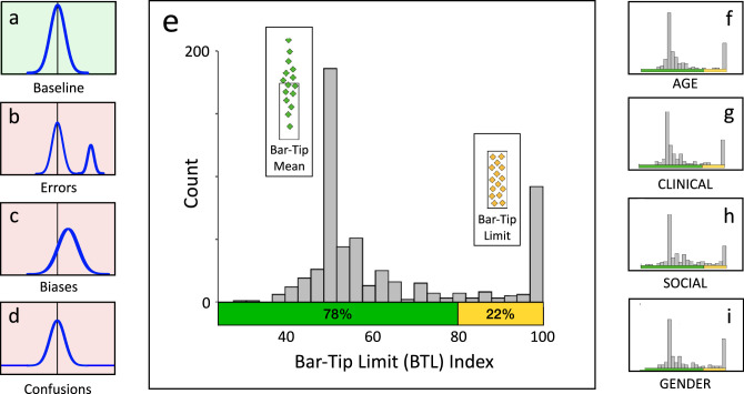
Figure 14.
Bimodal distribution of Bar-Tip Limit (BTL) index values reveals that the BTL error represents a categorical difference. The main graph (e) plots the distribution of BTL index values for all 551 DDoG measure drawings. The left inset graphs show visual definitions of: (a) baseline (no systematic inaccuracy), (b) errors, (c) biases, and (d) confusions (Figure 8). Note how closely e (our data) matches b (data pattern for errors). The right inset graphs (f, g, h, i) plot BTL indices by graph stimulus (AGE, CLINICAL, GENDER, SOCIAL), which provide four internal replications of the aggregate result (e). The colors on the x-axes indicate the location of the computed cutoff of 80, taken from our cluster analyses, between the two categories of responses: Bar-Tip Mean responses (green) and Bar-Tip Limit (BTL) responses (yellow).

