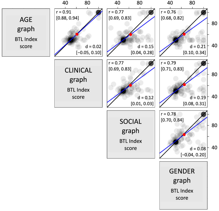
Figure 16.
The Bar-Tip Limit (BTL) error persists across differences in graph form and content. Each of the six subplots in this figure compares individual BTL index values for two graph stimuli, one plotted as the x-value and the other as the y-value. Each gray dot represents one participant's data. Mean values are shown as red dots. Gray dots are semitransparent so that darkness indicates overlap. High overlap is observed near BTL index values of 50 (Bar-Tip Mean) and 100 (Bar-Tip Limit) for both stimulus graphs, indicating persistence of interpretation between compared stimuli, despite differences in graph form and content. This persistence is reflected numerically in the high correlations among (Pearson's r), and the small mean differences between (Cohen's d), graph stimuli. The high correlations are echoed visually by steep lines of best fit (blue), and the small differences are echoed visually by the proximity of mean values (red dots) to lines of equivalence (black lines, which show where indices are equal for the two stimuli). In brackets are the 95% CIs for r and d.

