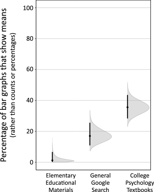
Figure 19.

Count bar graphs are more common than mean bar graphs across three major domains. Mean bar graphs plotted as a percentage of total bar graphs (i.e., mean bar graphs plus count bar graphs). “Elementary Educational Materials”: Google Image search for grades 1–9 (n = 81). “General Google Search”: Google search for “bar graph” (n = 100). “College Psychology Textbooks”: bar graphs appearing in eight widely used college Introductory Psychology textbooks (n = 149). Vertical lines show 95% CIs, and gray regions show full probability distributions for uncertainty around the percentage values. In all three cases, the percentage of mean bar graphs remains substantially, and statistically robustly, below 50%.
