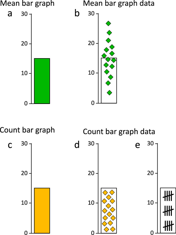
Figure 2.

Data distribution differs categorically between mean and count graphs. (a) Mean bar graphs and (c) count bar graphs do not differ in basic appearance, but they do depict categorically different data distributions. (b) In a mean bar graph, the bar-tip is the balanced center point, or mean, with the data distributed across it. We call this a Bar-Tip Mean distribution. (d, e) In a count bar graph, the bar-tip acts as a limit, containing the summed data within the bar. We call this a Bar-Tip Limit (BTL) distribution.
