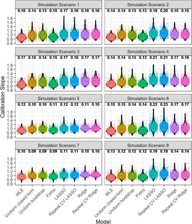
Figure 1.
Boxplot and violin plot showing the distribution, across iterations, of the calibration slope, upon validation. The numbers above each plot show the root-mean-square deviation of the calibration slope. Random jitter has been applied to each point to aid visual clarity. The numbering of simulation scenarios is given in Table 1.

