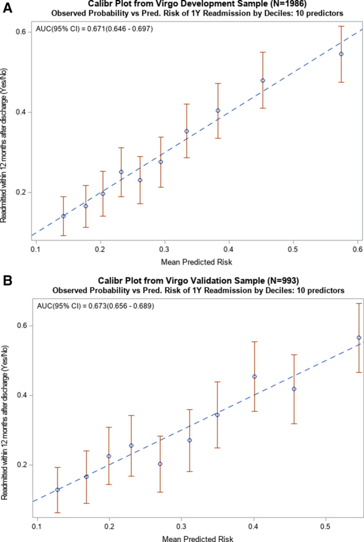
Figure 3. Calibration plots of observed vs predicted risk from the 10‐predictor risk model of all‐cause readmission within 1‐year of hospitalization for AMI among younger adults.

A, Calibration plot from the development sample (N=1986) used to create the 10‐predictor risk model that demonstrates how well the deciles of observed and predicted probabilities of 1‐year readmission agree over the entire range of predicted risk, where the diagonal line represents perfect agreement. B, Calibration plot from the validation sample (N=993) used to exhibit successful application of the 10‐predictor model by demonstrating how well the deciles of observed and predicted probabilities of 1‐year readmission agree over the entire range of predicted risk, where the diagonal line represents perfect agreement. AMI indicates acute myocardial infarction; and AUC, area under the curve.
