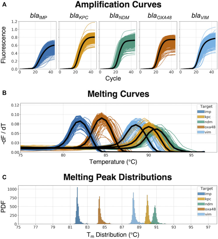
FIGURE 3.
Real-time amplification and melting curves obtained from the dPCR instrument. (A) Raw amplification curves at different concentrations from synthetic DNA templates; the black line represents the average trend of the kinetic information based on each specific target-primer interaction. (B) Melting curves across the five different CPO; the black line represents the average trend of the thermodynamic information based on each specific target-primer interaction. (C) Melting peak (Tm) distribution from the dPCR instrument, showing the probability density function (PDF) for each target.

