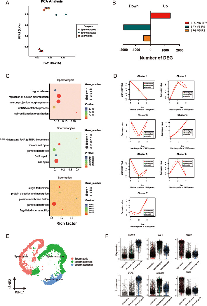
Fig. 3.
Comparative analysis of the data between bulk RNA-seq and scRNA-seq. (A) Results of principal components analysis (PCA) for the bulk RNA-seq samples, spermatogonia, spermatocytes and spermatids. (B) Differentially expressed genes (DEGs) for each pairwise comparison. (C) Representative GO terms and P values are shown for each cell type. (D) Data visualization according to the cluster analysis. Each plot shows the average expression profile of the gene clusters from all samples. Dots show the actual average expression values for each sample (red represent spermatogonia, green represent spermatocytes and the blue represent spermatids). (E) t-SNE plots show the identified cell types (cells are colored by the germ cell types). (F) Visualization of marker gene expression across germ cells in the violin plot

