Fig. 3.
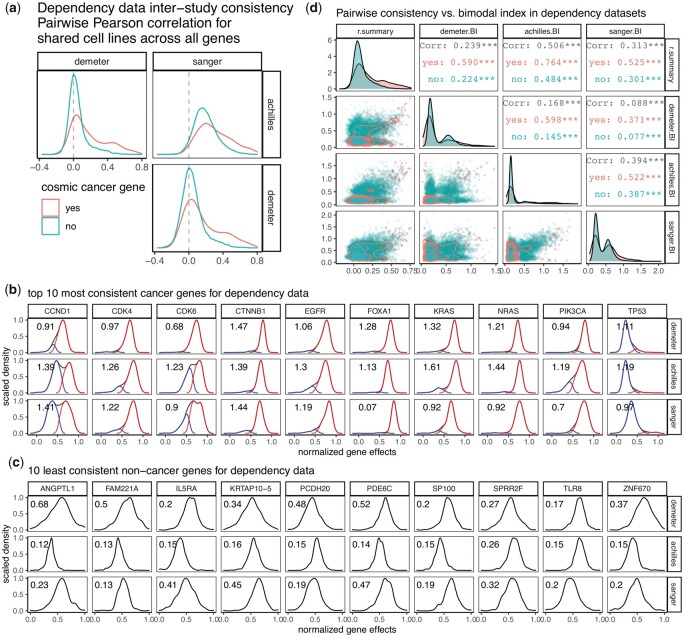
Dependency inter-study consistency. (a) Density plots showing distribution of pairwise correlation coefficients from correlating gene effect scores among three dependency datasets. Comparison of correlations was made between oncogenes and all other genes (coral versus turquoise). (b) Density plots showing distribution of the 10 most consistent cancer genes in three dependency datasets. Samples were classified into low and high groups by Gaussian mixture modeling assuming equal variance, and the distribution of each group was plotted as well. (c) Density plots showing distribution of the 10 least consistent non-cancer genes in three dependency datasets. In both b and c, bimodal index (BI) was calculated and printed on the upper left corner of each plot. A higher BI value is indicative of a stronger bimodal distribution. (d) Pairwise scatterplot matrix showing the relationship between inter-study consistency measure ‘r.summary’ and BI from each of the three dependency datasets, with comparison made between oncogenes and all other genes (coral versus turquoise). Lower triangular panels show the actual datapoints with 2D density plots overlaid. Diagonal panels are distribution of each measure in the form of density plots. Upper triangular panels provide statistics from Pearson correlation. ***, P-value < 0.001

