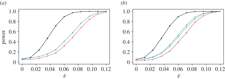
Figure 8.
Power curves of the USP test in the sparse example with , compared with Pearson’s test (a) and both the -test and Fisher’s exact test (b). In each case, the power of the USP test is given in black. The power functions of the quantile versions of the first two comparators are shown in blue (a) and purple (b), while those of the permutation versions of these tests are given in red (a) and green (b). The power curve of Fisher’s exact test is shown in cyan on the right. (Online version in colour.)

