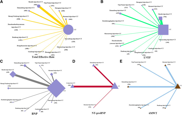
FIGURE 3.
Network diagrams of comparisons on different outcomes of treatments in different groups of patients with CHD-HF. (A) total effective rate; (B) LVEF; (C) BNP; (D) NT-proBNP; (E) 6MWT. Each node represents a type of treatment. The node size is proportional to the total number of patients receiving a treatment (in brackets). Each line represents a type of head-to-head comparison. The width of lines is proportional to the number of trials comparing the connected treatments.

