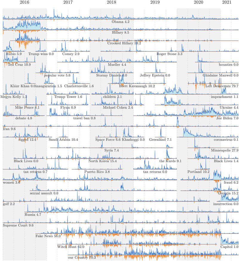
Fig 3. Example time series of narratively dominant 1-grams and 2-grams for Trump-matching tweets.
Each time series shows the relative usage rate for n-grams (blue curve), and Trump’s level of narrative control (inverted orange curve with pale pink fill). See the Online Appendices (compstorylab.org/trumpstoryturbulence/) for full time series for all n-grams which have been narratively dominant on at least three days. The background shading and vertical dashed lines indicate years and quarters.

