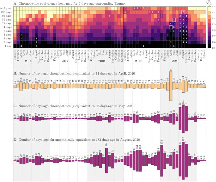
Fig 4. A.
Chronopathic equivalency heat map: Each cell represents the ‘story distance’ for a given month and a given number of δ days before. We measure story distance as the median rank-turbulence divergence (RTD) between the Zipf distributions of 1-grams used in Trump-matching tweets for each day of a month and δ days before (we use RTD parameter α = 1/4). Lighter colors on the perceptually uniform color map correspond to higher levels of story turnover. Numbers indicate the slowest five months for each value of δ. After the story turbulence of the 2016 election year and especially the first year of Trump’s presidency, there has been a general slowing down in story turnover at all time scales (the ‘plot thickens’). By September US of 2020, the COVID-19 pandemic had induced record slowing down of story turnover around Trump at time scales up to 91 days, the story being punctuated by and then combined with the Black Lives Matter protests in response to George Floyd’s murder on May 25, 2020. B. Using an example anchor of April 2020 and δ = 14 days (white square in panel A), a plot of chronopathic equivalent values of δ across time. During Trump’s presidency, the same story turnover occurred as fast as every 1.8 days in September 2017 and 1.7 days in October 2020. Because story turbulence is nonlinear, using a different anchor month and δ (i.e., selecting a different cell in the heatmap) potentially gives a different chronopathic equivalency plot. C. Anchor of 56 days in May 2020. D. Anchor of 182 days in August 2020. See the Online Appendices (compstorylab.org/trumpstoryturbulence/) for the most recent version of this figure. As for Fig 3, shading and lines give guides for years and quarters.

