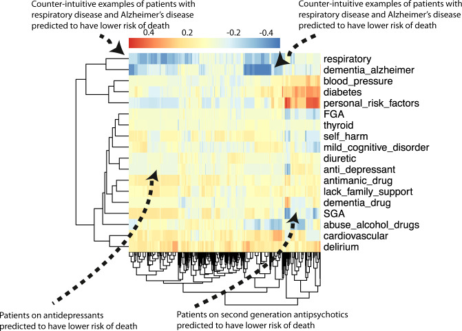
Fig. 6. Class-contrastive heatmap for the deep learning model.
Visualization of the amount of change predicted in the probability of death by setting a particular feature to 1 versus 0. Predictions are made on the test set using a random forest model built on top of the autoencoder. Columns represent patients and rows represent features. The arrows at the top indicate counter-intuitive examples. If these patients had a respiratory disease or Alzheimer’s disease, the model predicts low risk of death. The arrows at the bottom indicate a group of patients on antidepressants and SGA who are predicted to have low risk of death. The heatmap also shows a hierarchical clustering dendrogram, which is performed using an Euclidean distance metric and complete linkage. We note that even though we cluster the features (columns) we do not aim to imply any similarity between them. FGA: first-generation antipsychotics.

