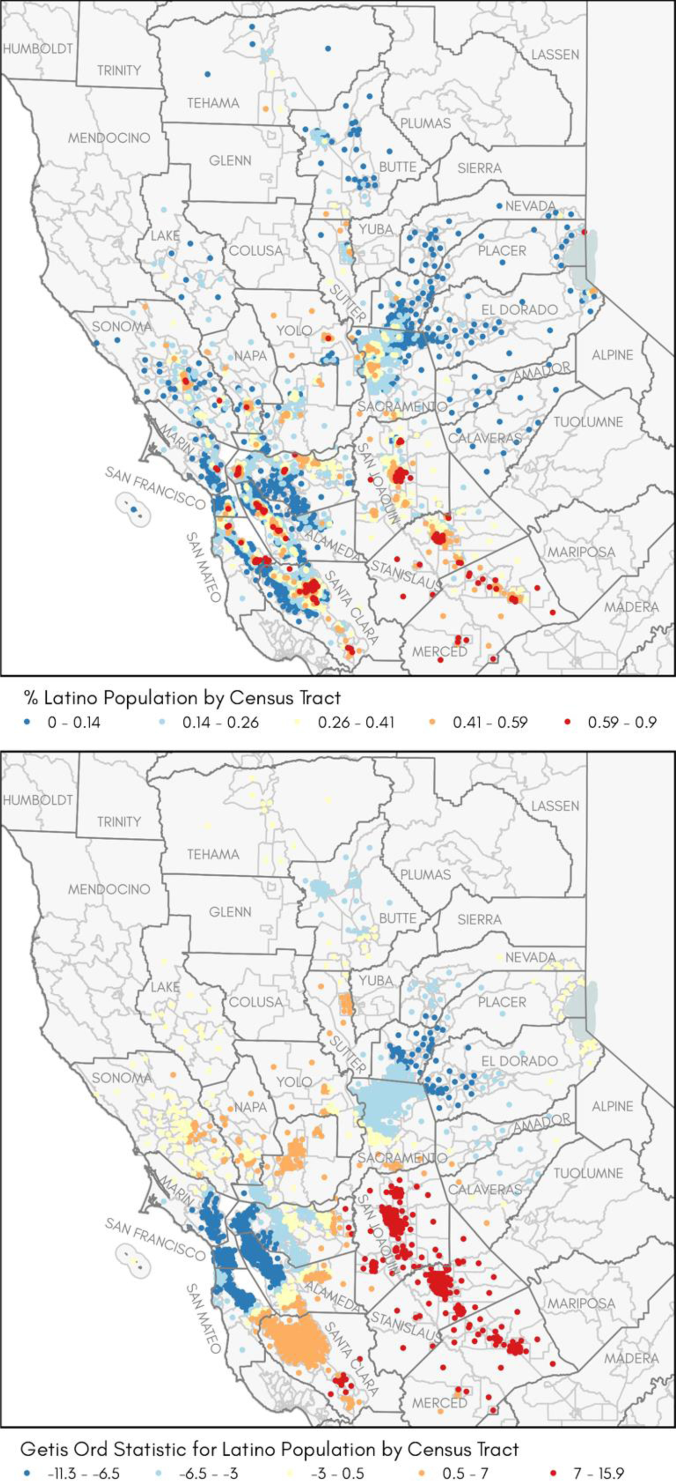
Figure 2.

Observed distribution of Latino population by census tract: (a) Each census tract is represented by its centroid (geometric center), where blue dots represent tracts with the lowest percent, and red dots represent tracts with the highest percent of Latino population; (b) Calculated Getis-Ord Gi* statistic where red represents tracts with z-scores > 1.645 indicating high degree of clustering (ɑ = 90%; 95%; 99%); blue represents tracts with z-score < 1.645 indicating low degree of clustering; yellow dots indicate a random pattern (no evidence of clustering).
