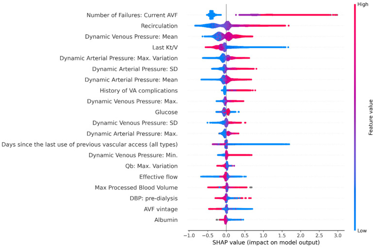
Figure 3.
Shapley additive explanations (SHAP) plot showing relative feature importance. Each dot represents one individual subject from the test dataset. Colour Coding: the red colour represents higher value of the variable; the blue colour represents a lower value of the variable. The X axis represent the impact of variables on risk in terms of SHAP values. Positive values suggest direct correlations between risk factors and the occurrence of AVF failures. Negative values suggest inverse correlation between risk factors and the occurrence of AVF failures. Note: AVF, arteriovenous fistula; DBP, diastolic blood pressure; SD, standard deviation; Qb, blood pump flow.

