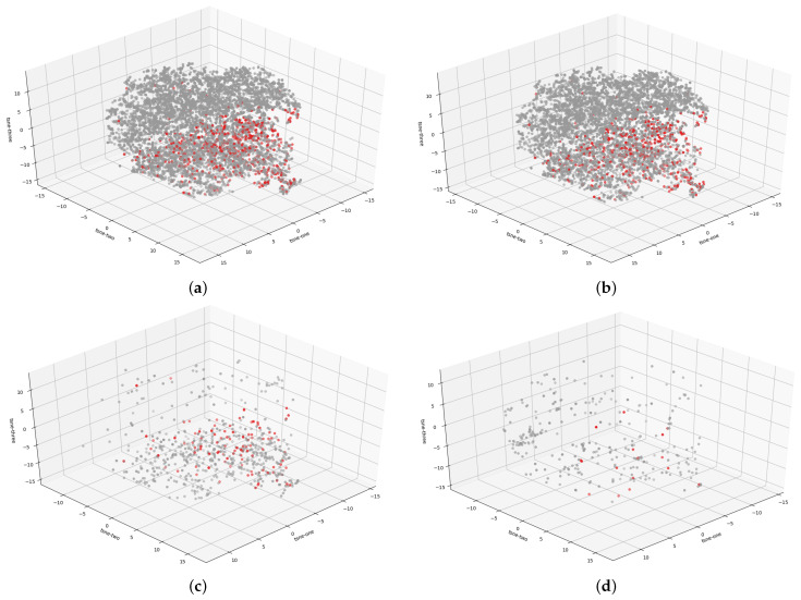
Figure 3.
Interpretation of the 3D t-SNE plot visualization of the HAM10000 dataset where the red dots indicate melanoma cases while gray dots represent benign lesions. The following figures present the distribution of malignant and benign cases for the (a) entire dataset, (b) trunk-extremities dataset, (c) face-head dataset, and (d) acral dataset.

