FIG. 5.
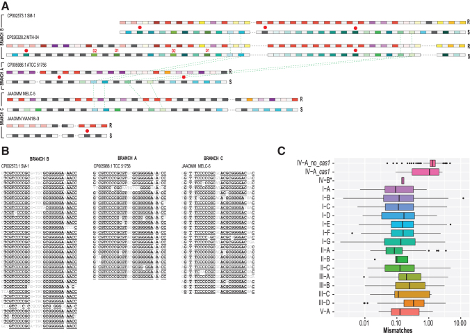
Comparative analysis of repeats and spacers in F. caldus strains and repeat polymorphism in type IV arrays in general. (A) CRISPR arrays for five unique loci. For each CRISPR array, two lines representing repeats (above) and spacers (yellow) are shown. In the first line, repeats (R) are color coded as follows: identical repeats that occur twice or more are shown by rectangles of the same color, unique repeats are shown by dark gray rectangles, and spacers are shown by light gray rectangles. In the second line, spacers (S) are color coded as follows: spacers that are 90% identical and occur twice or more are shown by rectangles of the same color, unique spacers are shown by dark gray rectangles, and repeats are shown by light gray rectangles. Two parts of CRISPR arrays, upstream and downstream of csf2 gene and interrupted by insertions, are separated by a dashed line (see Fig. 3). Duplicated spacers are indicated by D1 and D2, respectively. Red circles indicate spacers with protospacers identified. Green dashed lines indicate spacers common between two branches of the tree shown on the Figure 3. (B) Multiple alignments of CRISPR repeats identified in three representative strains from three branches of the tree shown on Figure 3. Underlined letters indicate positions with at least 90% identity. (C) Number of repeat mismatches for CRISPR arrays per CRISPR-Cas type. The box plot shows the weighted average number of repeat mismatches versus repeat consensus per CRISPR array. CRISPR-Cas type indicated on the y-axis. For subtype IV-A, the estimates were obtained separately for loci without cas1 (IV-A_no_cas1) and with cas1 gene (IV-A_cas1). The asterisk at IV-B indicates that results were obtained only for a small branch within the subtype IV-B corresponding to the proposed subtype IV-D, where five loci with CRISPR arrays were identified. The remaining IV-B and IV-C arrays were not included because in these loci, arrays are scarce and show a highly patchy distribution (see Fig. 1). The boxes show the 25th/50th/75th percentiles, and black dots show outliers that fall above 1.5 × interquartile range. For type I, there are ∼10% outliers shown as dots.

