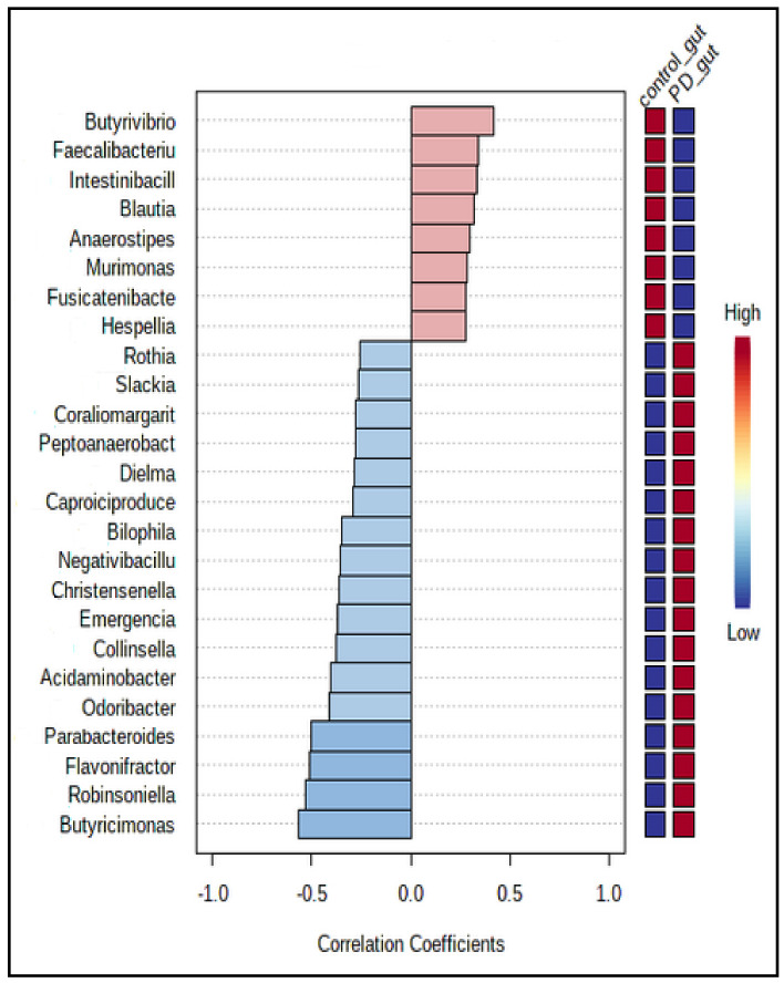
Figure 5.
The Pearson r correlation, showing the top 25 features correlated with the taxa of interest. The 25 genera were ranked by their correlation. The blue color represents negative correlations, whereas the red color represents positive correlations. The deeper color (blue or red) means, the stronger correlation. The mini heatmap on the right side of the plot shows the high or low abundance in two groups.

