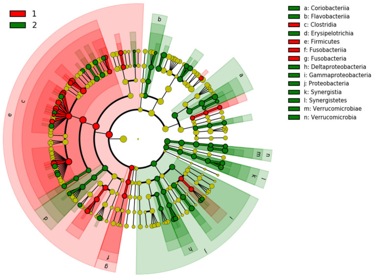
Figure 7.
Cladogram generated by LEfSe shows the taxa differences between PD patients (2) and healthy controls (1). The central yellow dot in each cladogram represents kingdom; each successive circle is one step lower phylogenetically (phylum, class, order, family, and OTU). Regions colored in red indicate taxa enriched in controls compared to those enriched in PD patients marked with green regions.

