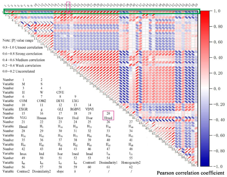
Figure 9.
Plot of correlation coefficients between the dependent variable (volume M) and the independent variable. Red represents positive correlation and blue represents negative correlation, and the smaller the ellipse and the darker the color, the higher the correlation between the two variables. The green box indicates that the column is the correlation between the dependent variable and each independent variable, and each ordinal number in the figure represents a variable. For example, 20 represents Hmed, and its correlation with the dependent variable M(1) is the ellipse corresponding to the number 20 in the green box.

