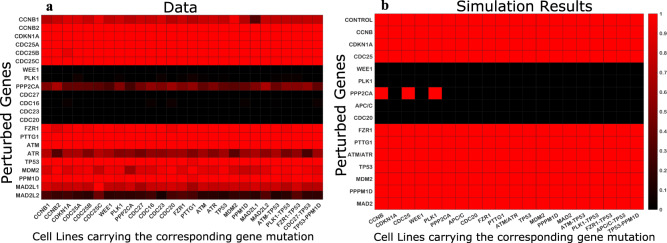
Fig. 5. Heatmaps showing the gene perturbation results in different cancer cell lines.
a The results derived from CRISPR (Avana) Public 20Q4 perturbation data analysis. The data were downloaded from Cancer Dependency Map database (depmap.org). b The model simulation results. The perturbed genes are listed along the y-axis, the cell lines carrying mutations in specific genes listed along the x-axis. The color scale shows whether the gene is reported essential or not. The black color shows that a gene is essential and the red color shows that a gene is not essential. For the heatmap representing the experimental data (a), we counted how many times a gene is reported as essential in each cell line carrying a specific gene mutation. For example, PLK1 gene is reported to be essential in all cell lines (black line), while ATR gene is essential in most cell lines carrying CCNB1 gene mutation (the heatmap rectangular cell is colored closer to black than red) but not in cell lines carrying CCNB2 mutation (the heatmap rectangular cell is colored closer to red than black). For the model results (b), the rectangular cell of the heatmap is colored black if a cell cycle arrest was observed and is colored red if the normal cell cycle progression was observed when genes were perturbed. The control represents unperturbed cancer cells. All unperturbed cancer cell lines were observed to be progressing through the cell cycle, thus are shown by red colored rectangular cells of the heatmap on the right.

