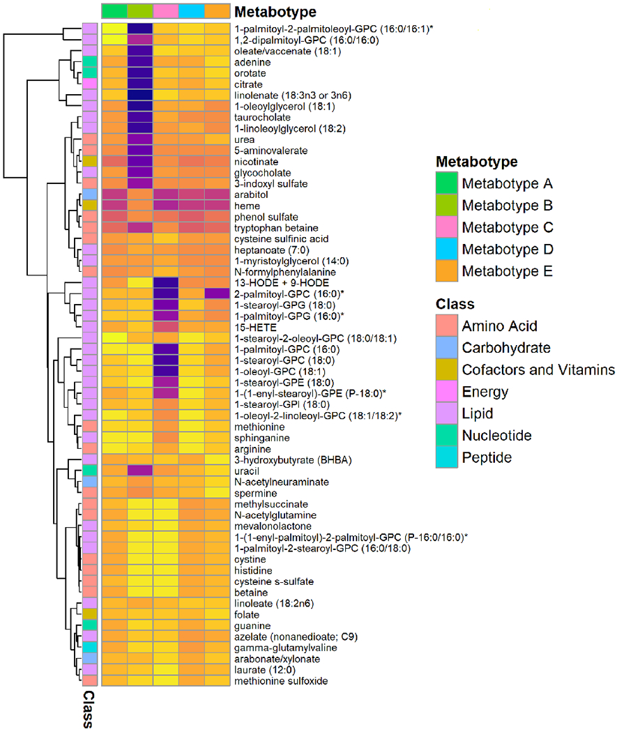
Figure 2. Abundance of selected nasopharyngeal metabolites between five metabotypes of severe bronchiolitis.

The normalized metabolomics data (50 metabolites with highest variance and top 10 metabolites in the metabolite-set enrichment analysis) are used to visualize the between-metabotype differences. The top row represents five different metabotypes (A-E). The first column on the left represents a major metabolite class (e.g., amino acids, lipids) for the corresponding metabolite. The tree on the left represents hierarchical clustering of metabolites. Each cell represents the median value of normalized metabolite data within each metabotype—the yellow color represents a high value, and dark purple color represents a low value. Asterisk on some metabolites indicates a compound that has not been confirmed based on a standard, but we are confident in its identity (by Metabolon, Inc).
