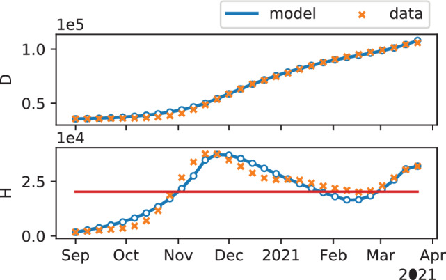
FIGURE 2.

Results of the model calibration. The first two plots show the temporal evolution of the number of deaths and hospitalized individuals, respectively, as predicted by the model (blue curve, where a series of resurgent waves can be noticed), compared with the officially reported data (orange crosses) that are used to calibrate the model. 35 The red horizontal line in the second plot denotes the estimated critical number of hospitalizations . The model parameters identified are summarized in Table 1
