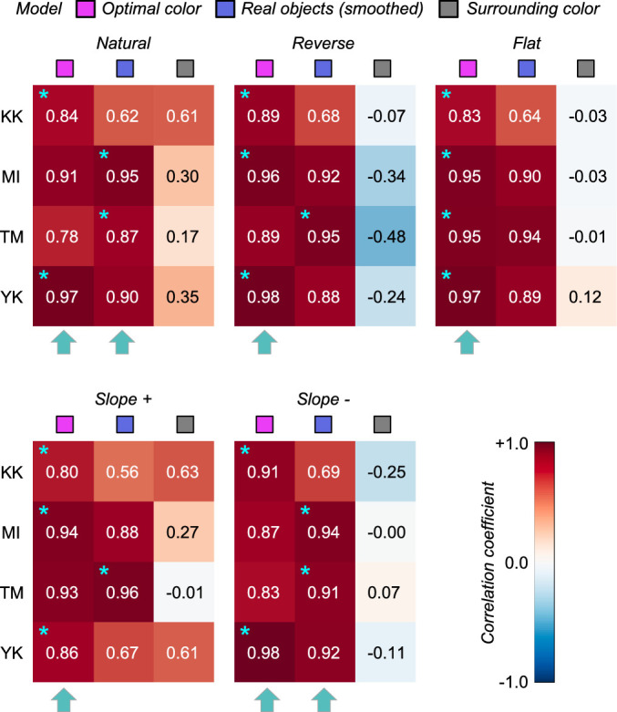
Figure 6.

The matrices of Pearson's correlation coefficients calculated between observer settings and model predictions over nine test chromaticities. Each subpanel represents each distribution condition (natural, reverse, flat, slope+, and slope-). The color of each individual cell indicates the correlation coefficient as denoted by the color bar. The cyan star symbol indicates the highest correlation coefficient across the three models. The cyan arrows at the bottom of each subpanel show the model that received the highest number of cyan star marks, indicating a good candidate model of human observers’ strategy to judge the self-luminosity of a surface.
