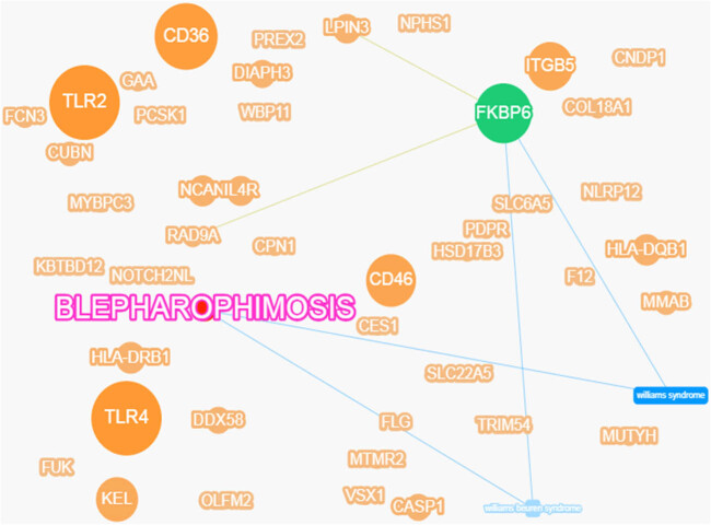
Figure 5.
Gene-disease phenotype association network diagram. The size of the spots indicates the strength of the gene’s association with disease. The larger the dot, the stronger the correlation. The green dot indicates genes that have been reported or found to be associated with the related disease in the database. The lines indicate that the genes or diseases on either side of the line are related.

