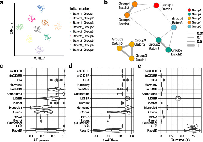
Fig. 2.
CIDER accurately identifies cross-batch populations. A t-SNE plot shows the nine initial clusters from three batches of the simulated dataset (Dataset 2). Cells are colored by initial clusters. B The graph network shows the similarity among initial clusters. Vertexes represent initial clusters, colored by populations. The width of edges represents the similarity levels. C Distribution of ARIpopulation for 20 replicates of simulated data across integration workflows and clustering algorithms. The x-axis denotes the workflow performance by calculating ARIs between cell populations and clustering results, and the y-axis denotes clustering and integration workflows. The whiskers from left to right in the boxplot represent the first quartile, the median, and the third quartile. D, E Distribution of 1-ARIbatch (D) and runtime (E) for 20 replicates of simulated data across integration workflows and clustering algorithms

