Fig. 3.
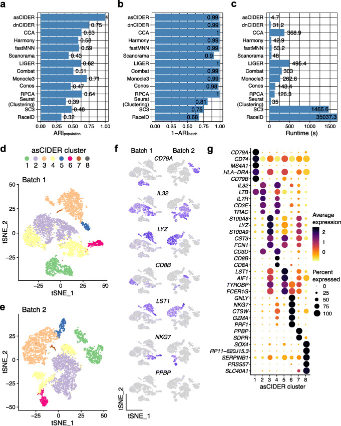
CIDER leads to precise cell classification in the joint PBMC data sequenced by two techniques (Dataset 3). A–C Distribution of ARIpopulation (A), 1-ARIbatch (B), and runtime (C) across integration workflows and clustering algorithms. D t-SNE plot of cells from Batch 1, colored by asCIDER clustering results (final clusters). E t-SNE plot of cells from Batch 2. F t-SNE plots of cells show expression levels of marker genes in two batches. G Average expression levels and percentages of expression of top marker genes across asCIDER clusters. The size of dots denotes the percentage of expression, and the color represents the average expression level

