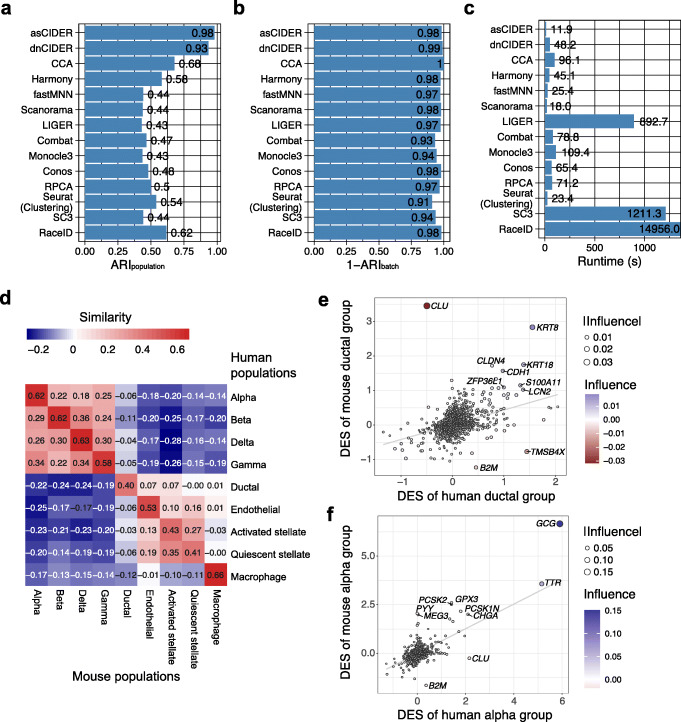
Fig. 4.
CIDER accurately identifies clusters between human and mouse samples in the cross-species pancreas data (Dataset 4). A–C Distribution of ARIpopulation (A), 1-ARIbatch (B), and runtime (C) across integration workflows and clustering algorithms. D Heatmap shows the inter-group similarity between mouse populations (x-axis) and human ones (y-axis). Cells are colored by the similarity levels, as shown by the numbers. E Scatter plot shows genes driving the similarity and dissimilarity between the human ductal group and the mouse ductal group. The x- and y-axes denote the DESs in humans and mice. Each dot is a gene, colored and sized by the influence and its abstract value. The gray line is the linear regression line for reference. Genes with the ten largest abstract values of influence are labeled. F Scatter plot shows genes driving the similarity and dissimilarity between the human alpha group and the mouse alpha group

