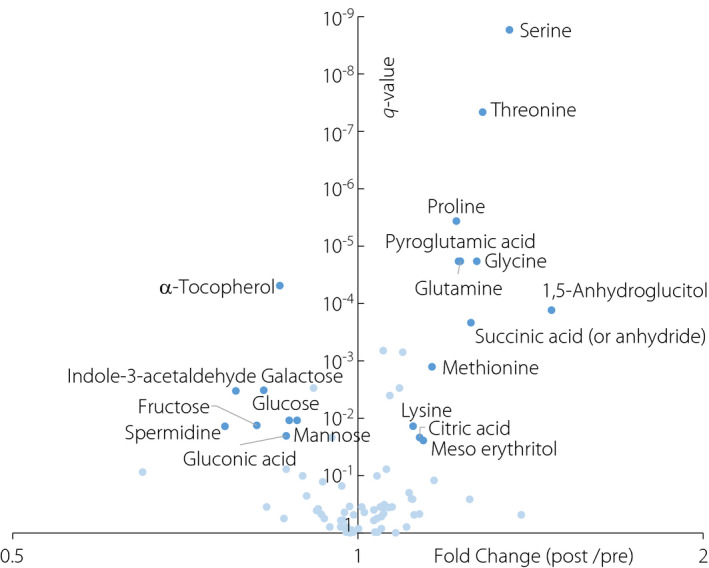
Figure 2.

Volcano plot showing the results of the paired t‐tests comparing the metabolite intensities of the pre‐treatment group and post‐treatment group. The x‐axis represents the fold‐change values (ratios between the median of post‐treatment values/the median of pre‐treatment values), whereas the y‐axis represents the q‐values (adjusted P‐values using the Benjamini–Hochberg method). Dark blue points represent the metabolites with a significant difference (q‐value ≤ 0.05) and 10% change (fold change ≥1.1 or ≤0.9). Light blue points represent the other metabolites.
