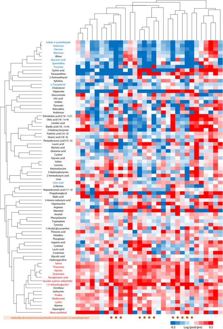
Figure 3.

The dendrograms with heat map showing the results of the hierarchical clustering to evaluate the association of metabolites from the perspective of the change caused by the treatment. Heat map represents the log of fold‐change values (post‐treatment intensity/pre‐treatment intensity ratios). Metabolites of red or blue characters indicate the metabolites with a significant increase or decrease (10%), respectively (the metabolites of a dark blue point in Figure 2). The brown circles represent the patients with decreased monosaccharide and increased 1,5‐anhydroglucitol.
