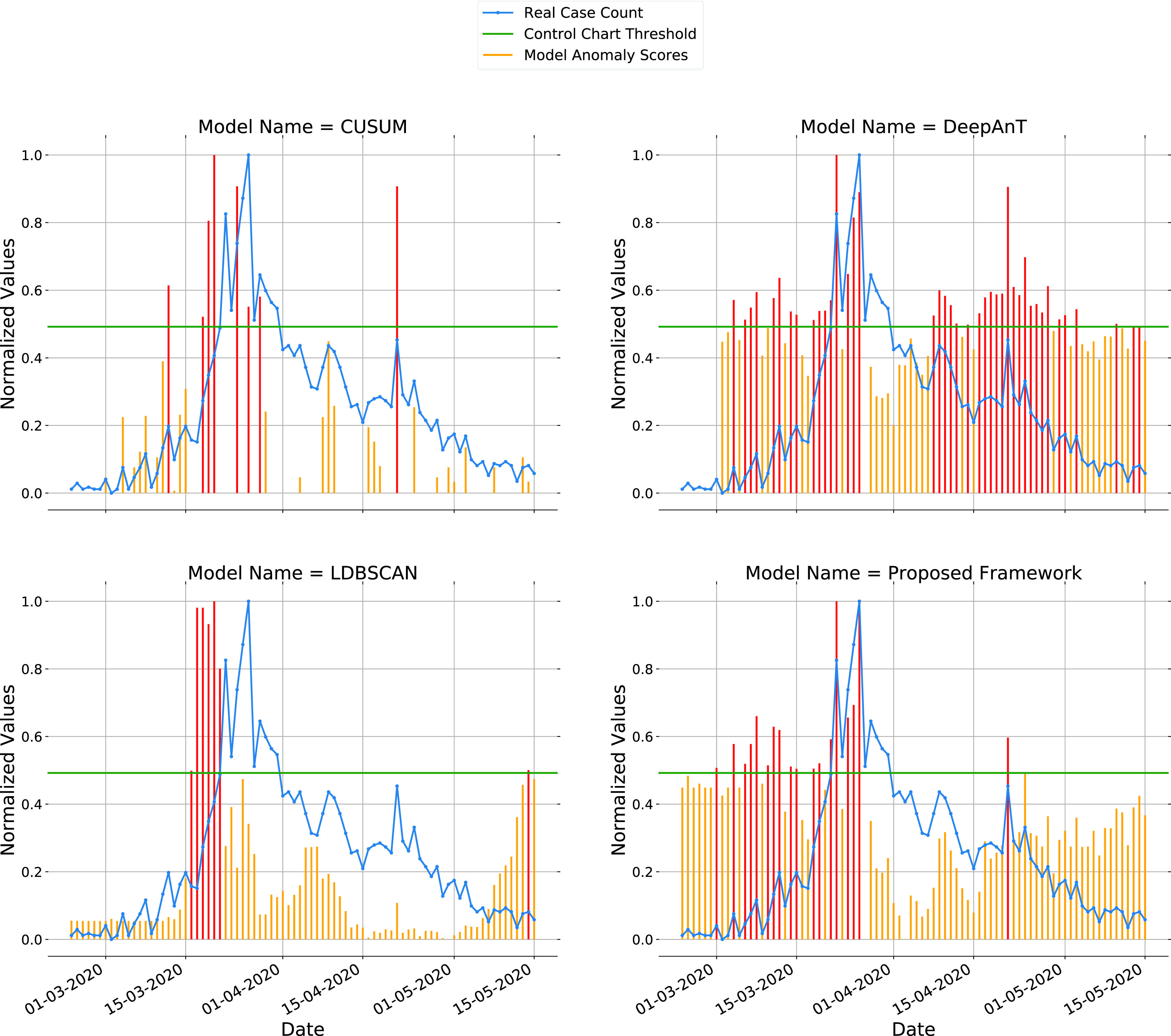
FIGURE 10.

Region Sicilia: Generated alarms of top performing models are plotted against daily real case counts for the parameter “new positive cases”. Shewhart control chart value is plotted as the threshold level. When a generated alarm signal passes the threshold level, it is plotted in red. A red alarm signal can be interpreted as an outbreak for the region.
