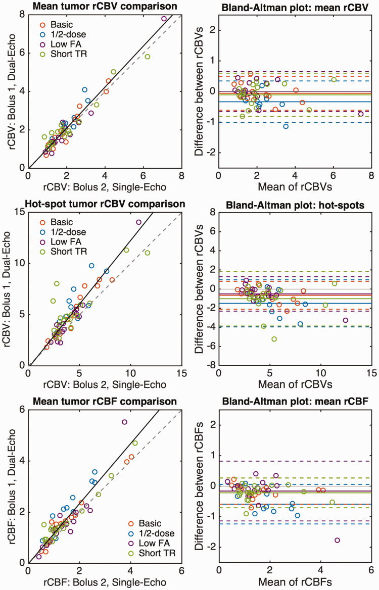
Figure 4.
Correlation (left) and Bland-Altman (right) plots for mean tumor rCBV (top), tumor rCBV hot-spot (middle), and mean tumor rCBF (bottom). Colored circles represent the values from each patient with each protocol. The correlation plots show the line of unity (dashed) and the best-fit line from Deming regression (solid line) combining all protocols. The individual Deming regression results are shown in Table 2. Bland-Altman plots show the bias (solid line) for each protocol, along with the LoA (dashed lines).

