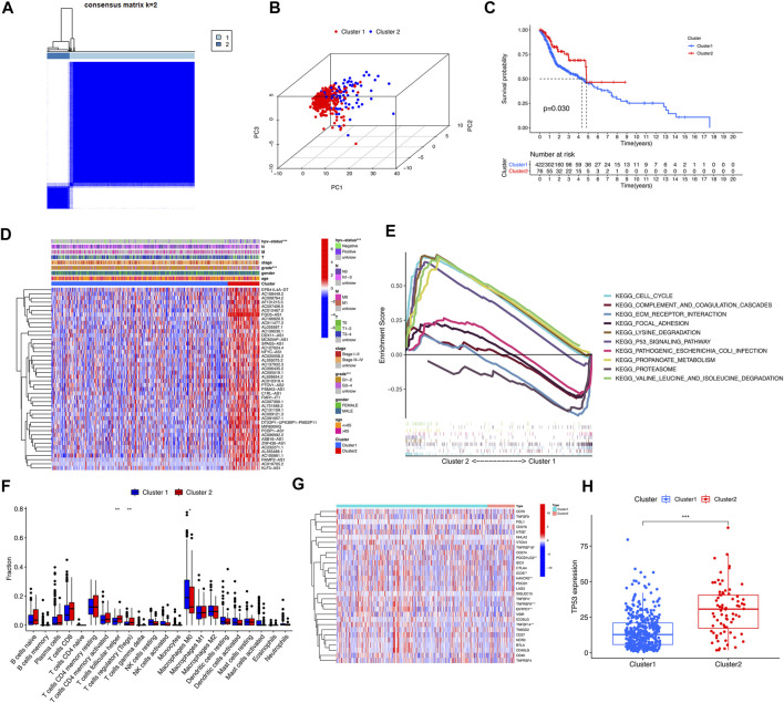
FIGURE 3.
Clinical characteristics and overall survival among different subgroups of HNSCC. *, **, *** represent p < 0.05, p < 0.01 and p < 0.0001, respectively. (A) Consensus matrix for optimal k = 2. (B) Principal component analysis (PCA) of cluster 1 and cluster 2. (C) Kaplan-Meier curve of overall survival (OS) time in Cluster 1 and Cluster 2 (p = 0.03). (D) Heatmap of the clinical features of the two clusters. (E) GSEA analysis displayed key pathways in in Cluster 1 and Cluster 2. (F) The violet plot showed the differential expression of immune cells between Cluster 1 and Cluster 2, in which Cluster 1 was represented in blue and Cluster 2 was represented in red. (G) The heatmap of the differential expression levels of 29 immune checkpoint genes between Cluster 1 and Cluster 2. (H) The boxplot of TP53 expression level between Cluster 1 and Cluster 2.

