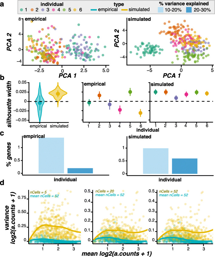
Fig. 2.
Simulated data compared to ss2-iPSC empirical scRNA-seq data. (a) PCA plots of cells colored by individual (max 50 cells shown per individual). (b) The distribution of cell silhouette widths using the individual as the cluster. The distributions are shown for cells grouped by type (left) and by type and individual (right), with the point and whisker showing the mean and standard deviation. (c) The percentage of genes (y-axis) with a given percentage of variance explained by individual. (d) The mean-variance relationship. The counts per gene were mean-aggregated (a.counts) across nCells from each individual and logged before calculating the population wide mean and variance. All cells were used from the empirical data (average = 52), while simulated data was down-sampled to nCells per individual

