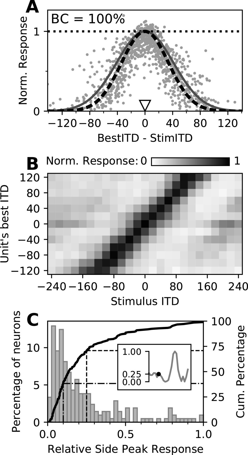
Figure 3.
Spread of activity across the map. A, Normalized neural responses as a function of the best ITD of each unit relative to the stimulus ITD. Each dot represents the normalized response of one neuron across 500 repetitions of a particular stimulus. Note that each neuron appears multiple times, paired with stimuli of different ITDs. Responses were normalized by the maximum firing rate of each neuron in an ITD tuning curve, denoted by the dotted horizontal line. Solid dark gray curve, The spread of activity presumed in the population vector readout model (Fischer and Peña, 2011); dashed black curve, the same function with the best fitting SD, used in the PV model based decoder. B, Neural responses across the map as a function of the stimulus ITD (x-axis) and their best ITD (y-axis). Neurons were pooled according to their preferred ITD (8–26 units/row). Gray scales indicate the normalized response (color bar), averaged across pooled neurons. C, Relative side peak responses of OT neurons. Response of the highest side peak relative to the maximal response as histogram (left y-axis) and cumulative distribution (solid curve; right y-axis). The inset exemplifies the method. The dashed and dash-dotted lines indicate the proportion of relative side peak responses <25% and <10%, respectively.

