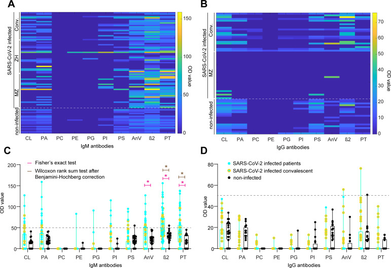
Fig 1. Heatmaps and boxplots for IgM and IgG aPL.
A. and B. Colour-coded representation of IgM (A) and IgG (B) aPL. Higher OD values are evident for AnV, β2, and PT IgM aPL. C. and D. Boxplot rep-resentation of IgM (C) and IgG (D) aPL. Dotted line: OD value 50, a cutoff determined previously by calculating the 99th percentile of 150 apparently healthy individuals (Roggenbuck et al., 2016; Nalli et al., 2018). Pink star: statistically significant distributional differences between non-infected controls and SARS-CoV-2 infected individuals according to Fisher’s exact test. Brown star: statistically significant distributional differences between non-infected controls and SARS-CoV-2 infected individuals according to Wilcoxon rank sum test after Benjamini-Hochberg correction. Black dots: Non-infected controls. Turquoise dots: SARS-CoV-2 infected hospital patients. Yellow dots: SARS-CoV-2 infected convalescent individuals.

