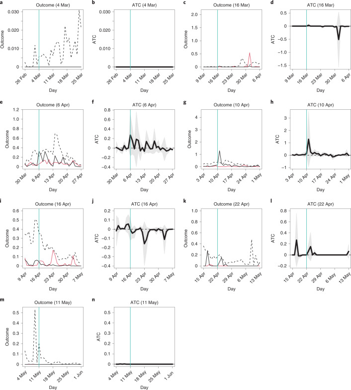
Fig. 1. Average outcomes and ATC values: main analysis.
a–n, The horizontal axis indicates dates in 2020, and the vertical turquoise line corresponds to the survey date. In a, c, e, g, i, k and m, the vertical axis represents the average number of confirmed cases per 100,000 residents, the black and red lines correspond to the average outcomes of the matched treated and control municipalities, respectively, and the dashed black line represents the average outcomes of all treated municipalities, both matched and unmatched. In b, d, f, h, j, l and n, the vertical axis represents ATC values, the thick black line indicates the point estimates of ATC values, and the shaded gray area presents the 95% confidence intervals. Cluster-robust standard errors were utilized where clusters were a pair of matched municipalities and a municipality. a, Outcome, 4 March. b, ATC, 4 March. c, Outcome, 16 March. d, ATC, 16 March. e, Outcome, 6 April. f, ATC, 6 April. g, Outcome, 10 April. h, ATC, 10 April. i, Outcome, 16 April. j, ATC, 16 April. k, Outcome, 22 April. l, ATC, 22 April. m, Outcome, 11 May. n, ATC, 11 May.

