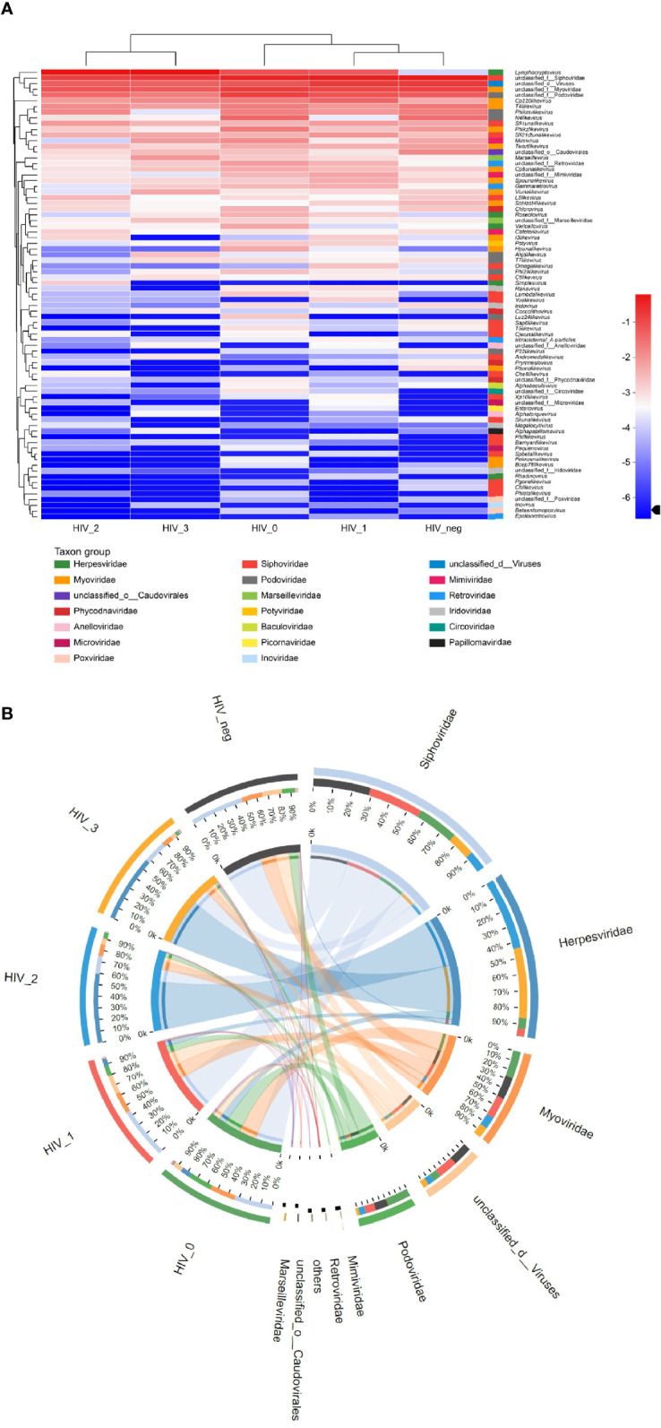
Figure 2.

Community composition analysis diagram. (A) Heatmap visualizing the abundance of all viruses in saliva samples at the genus level. The left and upper sides are the species cluster tree and the sample cluster tree, respectively; the right and lower sides are different taxon groups of the family. Color intensity represents species abundance. (B) Circos diagram visualizing the abundance of viruses in saliva samples at the family level.
