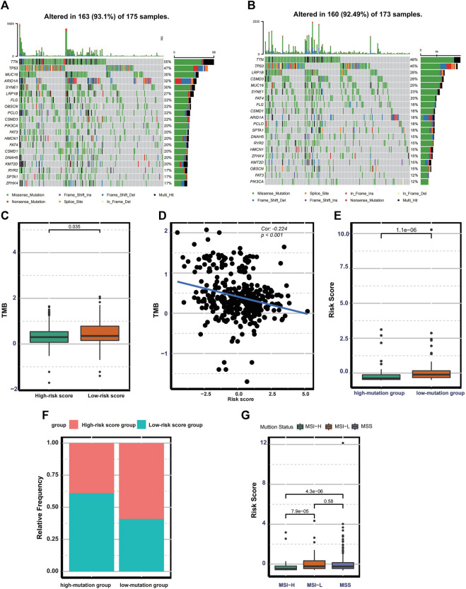
FIGURE 5.
Mutation landscape in the different risk groups. (A–B) Waterfall plot displaying the mutation profile of genes with high mutation rates in the low- and high-risk groups. (C) Boxplot exhibiting the difference in TMB between the low-and high-risk groups. (D) Spearman correlation analysis between TMB and the risk score. (E) Boxplot exhibiting the risk score difference between the low-and high-mutation groups. (F) The bar plot displaying the relative distribution of different risk groups between the low- and high-mutation groups. (G) Boxplot showing the risk score differences among MSS, MSI-L, and MSI-H.

