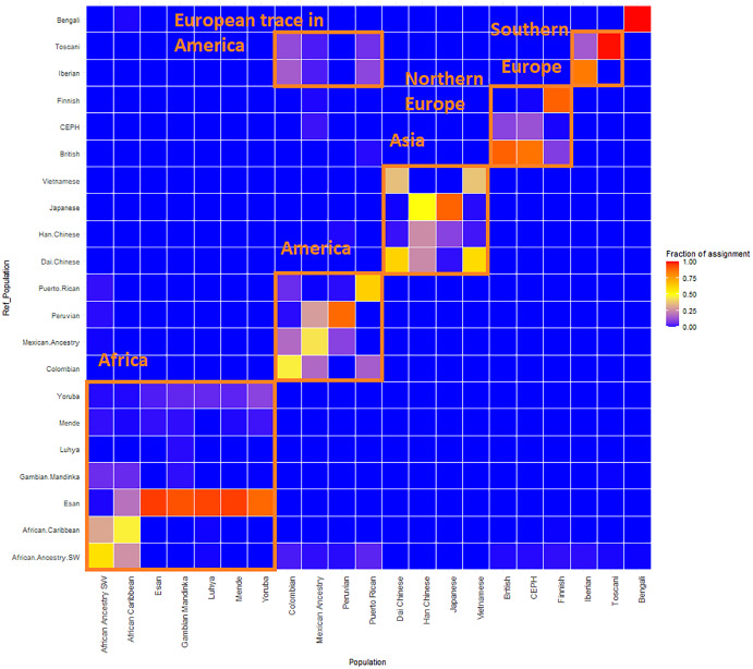
Figure 4. ReAdmix assignment matrix heatmap.
reAdmix analysis shows that population labels may not be 100% accurate; however, they are correct at the superpopulation level. This may be explained by the presence of admixed individuals in the dataset, and by shared histories by various groups. The assignment matrix indicates the percentage assignment. The color intensity of the heatmap shows the probability of an individual from a reference population (columns) being assigned to a given population (rows). The darkest shade indicates the highest probability and the lightest shade indicates the lowest.

