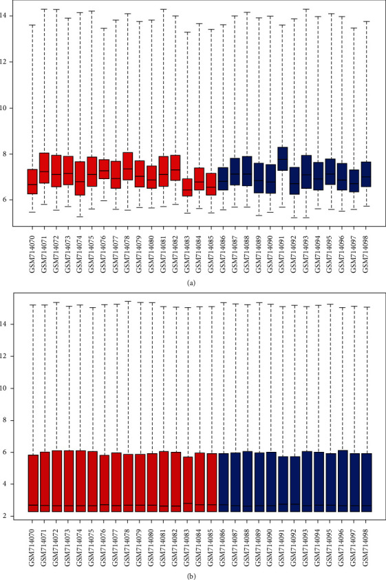
Figure 2.

Box plots for the gene expression data. Red bars represent advanced atherosclerotic plaque samples, and blue bars represent early atherosclerotic plaque samples. The black lines in each box represent the median gene expression level. (a) The black lines of raw data are not at the same level. (b) After data processing, the black lines are almost at the same level.
