Figure 3.
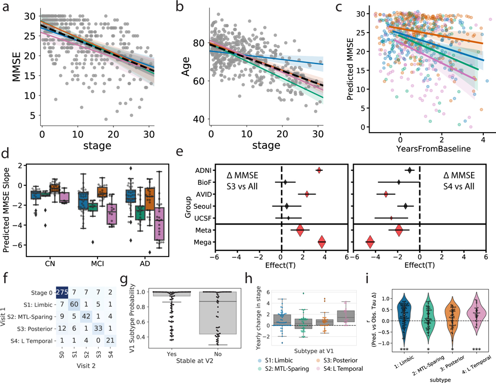
Progression of AD subtypes. Increasing SuStaIn stage is associated with lower age a) and worse cognition b) across all subtypes. c) Rate of longitudinal decline in MMSE for each subtype. The x-axis was jittered for visualization purposes only. The y-axis shows MMSE across all observations as predicted by linear mixed models adjusted for covariates. d) Boxplots showing the distribution of predicted MMSE slopes for each subtype, stratified by clinical diagnosis (stats in Supplementary Table S2). e) Cross-cohort meta-analysis for the effects of S4: L Temporal declining faster (left) and S3: Posterior declining slower (right) than other subtypes, respectively. Diamonds represent effect sizes, while diamond size reflects relative sample size. Red diamonds indicate significant effects. Error bars = SEM. f) Confusion matrix showing longitudinal stability of subtypes. Each row shows the number of subjects from a given subtype at Visit 1 that were classified as each subtype at Visit 2. The diagonal represents the number of subjects that were classified as the same subtype at Visit 1 and Visit 2. g) Individuals with a higher probability of being classified into their subtype at baseline were more likely to show a stable subtype over time (two-sided t[156,53]=5.26, p=3.6e-07). h) Annual change in SuStaIn stage for each subtype, in individuals with stable subtypes over time (stats in Supplementary Note 3). i) SuStaIn was used to predict longitudinal change in regional tau accumulation. Each dot represents a subject, and the y-axis represents the spatial correlation between the true regional tau change and the predicted regional tau change. Average predictions were significantly greater than chance based on a two-tided, one-sample t-test against 0 (S1: t[78]=5.00,p=3.5e-06; S2: t[52]=2.16,p=0.035; S3: t[45]=3.05,p=0.0039; S4: t[29]=4.93,p=3.1e-05). *p(unc.)<0.05, *** p(unc.)<0.001. Error bars in a-c represent 95% CI of model fit across 1000 bootstrap samples. For boxplots in d, g-i, center line=median, box=inner quartiles, whiskers=extent of data distribution except *=outliers

