
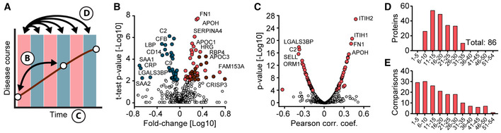
Figure 3. Identification of proteins altered in COVID‐19.
-
ASchematic of how proteins were compared across disease trajectories. Letters correspond to the panels in this figure. Red and blue boxes indicate binned time intervals.
-
BVolcano plot of the results of a one‐sample t‐test comparing the sample on the first day of sampling and the time point with the highest antibody levels. Blue‐colored proteins are significantly down‐ and red ones up‐regulated over time. Immunoglobulins are highlighted in dark red. The fold‐change in protein levels is depicted on the x‐axis and the ‐log10 t‐test P‐value on the y‐axis. Examples of significantly altered proteins are labeled.
-
CCorrelation of proteins with sampling time during hospitalization. Pearson correlation coefficients and ‐log10 P‐values are displayed on the x‐ and y‐axes, respectively. Z‐scored protein intensities were used for the correlating to take individual‐specific protein levels into account. Proteins significantly correlating with sampling time (positively or negatively) and a P‐value < 10−4 are highlighted in red. Examples of significantly altered proteins are labeled.
-
DNumbers of significantly altered proteins between the first day of sampling (day 0) and subsequent time intervals (binned days on the x‐axis), determined by one‐sample t‐tests.
-
ENumbers of samples per interval subjected to the one‐sample t‐test in (D).