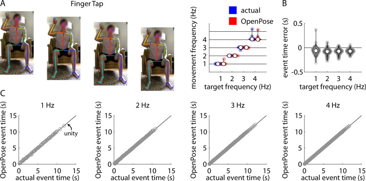
Fig 2.
A) Representative example of stillframes from an OpenPose output video of a participant performing the finger tapping task (left) and violin plots showing comparisons of individual participant mean finger tapping frequencies measured manually (“actual”, blue) and using our pose estimation workflow (“OpenPose”, red) across all four target frequencies (right). B) Violin plots showing event time errors (i.e., differences between video timestamps of finger taps as measured manually and using pose estimation) for each individual finger tap across all participants. In Fig 2A and 2B, white circles indicate group mean values, shaded circles indicate individual data points. These conventions are consistent across Figs 2–6. C) Scatter plots showing relationships between the video timestamps of all individual finger taps across all participants as measured manually (x-axis) or using our pose estimation workflow (y-axis) across all four target frequencies. Relevant correlation coefficients are included in the Results section of the text for Figs 2–6.

