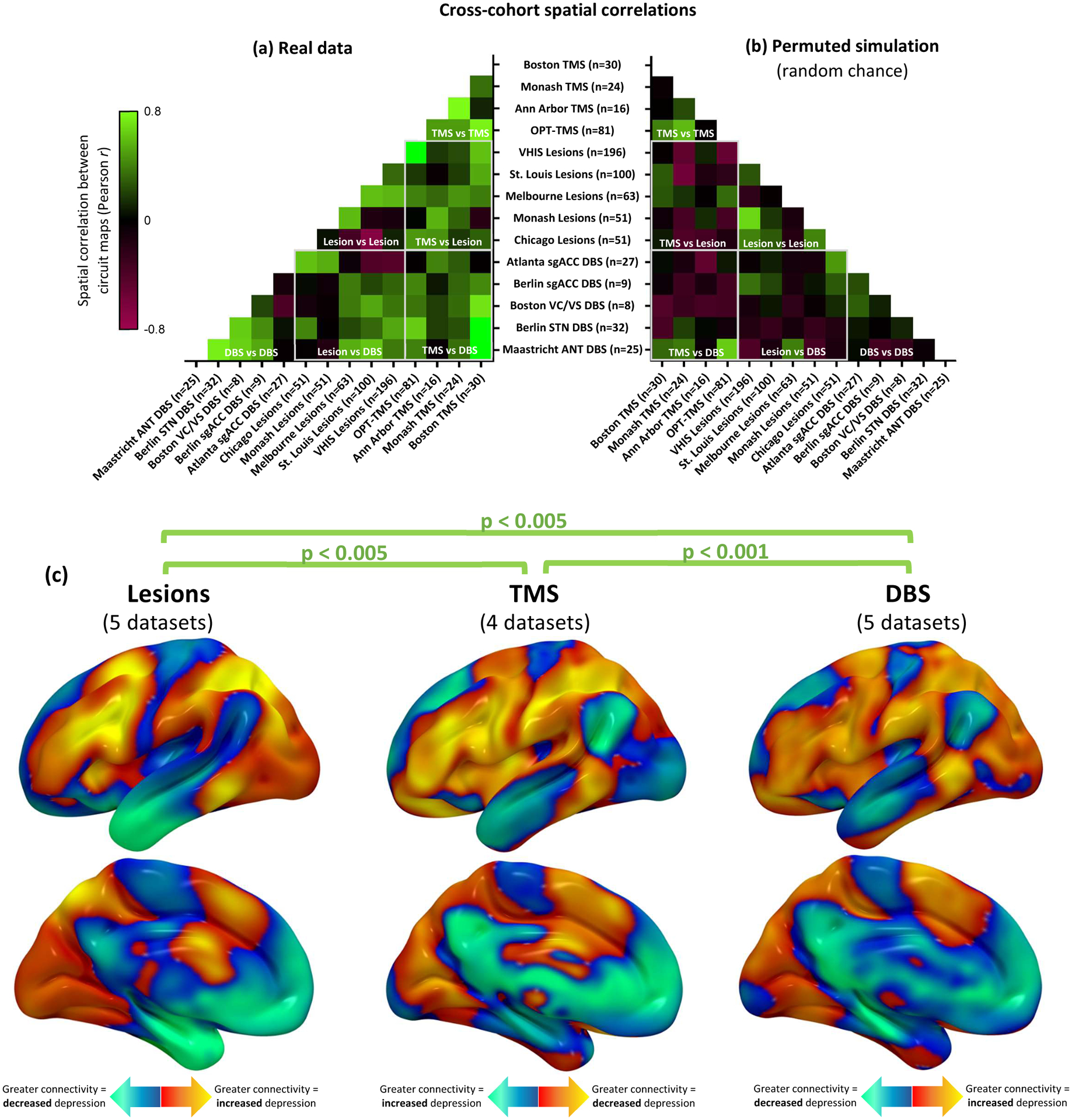
Figure 3: Depression circuit maps are similar across 14 datasets (n=713).

(a) The 14 circuit maps were consistently similar to one another (mean r=0.24, 95%CI 0.19–0.29), as depicted in this cross-correlogram comparing different datasets. Permutation testing confirmed that the weighted mean cross-correlation was significantly stronger than expected by chance (p<0.001, 10,000 permutations) Green colors represent high spatial correlation between circuit maps, black boxes represent neutral correlation, and red boxes represent negative correlation. (b) Representative example of correlation between circuit maps generated from randomly-permuted data. This analysis confirmed that no overall cross-correlation is expected by chance (mean r = 0.00, 95%CI −0.01–0.01). (c) Depression circuit maps were similar between lesion datasets (n=461), TMS datasets (n=151), and DBS datasets (n=101). Permutation testing confirmed that each comparison was significantly stronger than expected by chance (p<0.005, 10,000 permutations). For display purposes, depression circuit maps were averaged (weighted mean) across datasets within each modality. The color scale on TMS circuit maps is inverted to facilitate visual comparison to lesion and DBS circuit maps.
