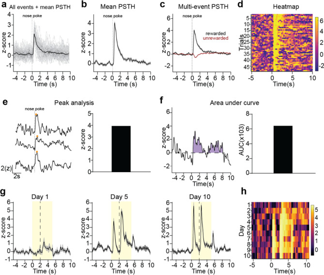
Figure 4.
Visualization of data from individual recordings. (a–f) A representative recording of GCaMP7b-expressing dopamine axons in dorsomedial striatum during an instrumental behavioral task in which animals nosepoke for reward is used to illustrate data visualization and analysis options. a) Peri-stimulus/event time histogram (PSTH) for rewarded nosepokes, in which the mean z-score (black) is plotted along with all individual trials (gray). (b) Mean PSTH for rewarded nosepokes plotting mean z-score with standard error. (c) A multi-event PSTH plot comparing average responses to rewarded (black) vs unrewarded (red) nosepokes. (d) Heatmap of all individual trials for rewarded nosepokes. Trials are shown in chronologically order from top to down. The color scheme for heatmaps in GuPPy is easily modifiable by the user. (e) Example traces illustrating peak detection. Orange dots indicate the detected peaks (left) and an average peak amplitude for all rewarded nosepoke trials is calculated (right). (f) An example trace illustrating area under curve (AUC) calculations. The AUC counted is colored in purple (left) and the average AUC for all rewarded nosepoke trials is calculated (right). (g,h) A representative recording of dLight1.3b in nucleus accumbens during a Pavlovian conditioning task is used to illustrate additional data visualization options comparing recordings across days. (g) PSTHs for days 1, 5, and 10 of Pavlovian training are show separately. A cue (yellow box) predicted reward (dotted line). (h) A heatmap is used to display average PSTHs across days 1–10 in a compact format, allowing easy visualization of the emergence of cue-evoked dopamine with training.

