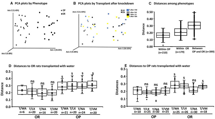
Figure 5.
Permanova and PCA plots to assess beta diversity. The first boxplot in each figure is the intra group variability, all others are inter-group variability. Distances represent similarity of the microbial composition between the samples: (A) Distances based on phenotype OP vs. OR (n = 24). (B) Knock down and transplant treatment (T) did not result in group separation other than by phenotype (n = 6). (Example: T after VM: means Transplant with microbiota of opposite phenotype after knockdown with VM). Data points represents the distribution of principal components in 3 different directions and the closer the data points, the closer the relationship between the samples. (C) Significant differences between OP and OR (pseudo-F = 27.6; P = 0.001 after 399 pairwise comparisons. (D) Significance of the distance to OR control rats treated with water from all other knockdown-transplant treatments (pseudo-F = 5.34; P = 0.001 (ns, not significant) (s, significant) (P < 0.05 after the number of pairwise comparisons shown on x-axis (n). (E) Significance of the distance to OP control rats treated with water from all other knockdown treatments (pseudo-F = 5.34; P = 0.001 (ns, not significant) (s, significant) (P < 0.05 after the permutations shown on x-axis. (ns, not significant) (s,significant) (P < 0.05) after the number of pairwise comparisons shown on x-axis (n).

