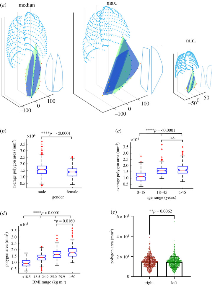
Figure 3.
Analysis of the maximum fitted polygon in the PRSP. Graphical representation of the area of the maximum fitted polygon (shown in royal blue) in the PRSP (shown in green) and ribs (shown in aqua) for the median, max and minimum participants. Outline of the shape is also shown in blue beside each (a). Analysis of the average area of the maximum fitted polygon in the PRSP with respect to gender (b), age (c) and BMI (d). Analysis of the area of the maximum fitted polygon on the left versus right side of the linea alba (e). Data are means ± s.d.; *p < 0.05, **p < 0.01, ***p < 0.001, n.s. = not significant.

