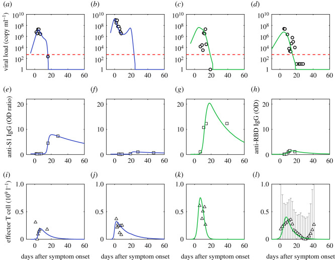
Figure 2.
Comparison of simulation of viral dynamics and adaptive immune response to data. (a,e,i) are fits of the first patient (patient ID labelled as P1); (b,f,j) are fits of the second patient (patient ID labelled as P3); (c,g,k) are fits of the third patient (patient ID labelled as P5) [35]; (d,h,l) are fits of the fourth patient (patient ID labelled as 902). Mild patients are in blue and severe patients are in green. Red dashed lines are the limit of detection [36]. Black dotted lines are normal ranges [4]. Viral load is from the nasopharyngeal swab. The effective T cell data is the reduction of CD3+ T cells in serum (Tserum) from its initial value (T0), which is assumed proportional to the concentration of effector T cells in organs. We assume the CD3+ T cell data of the patient with the same severity share similarities based on the distinction of CD3+ T cell data between groups of different severities [4] and approximate the CD3+ T cell dynamics of the fourth severe patient using the median data of the severe group [4].

